Bolt.Earth is India's Largest EV Charging Network and has made owning, driving, and charging electric vehicles in India easy for millions of people, inching closer to a goal of an accessible and sustainable form of transportation one day at a time.
The Bolt.Earth brand not only imbibes a far reaching, electric! approach but also, at its heart includes sustainability, ease of access, inclusivity and making the EV network asscessible to one and all.
The Bolt.Earth brand reflects in its very ethos, culture, people and processes
As part of the Innovate Conference digital art exhibit, I created a series of interactive installations that explored the intersection of art and technology. The installations featured custom software and hardware, and allowed users to interact with the art in new and exciting ways. (Re-write & Add icons to emphasise the role) ++ Tools

Bolt.Earth is a one stop solution for all your EV charging needs, powering the EV ecosystem.

Bolt.Earth products includes:
Charging based Product
Bolt.Earth app (For Electric Vehicle Charging)
CMS (Charging Management System)
Electric Vehicle based Products
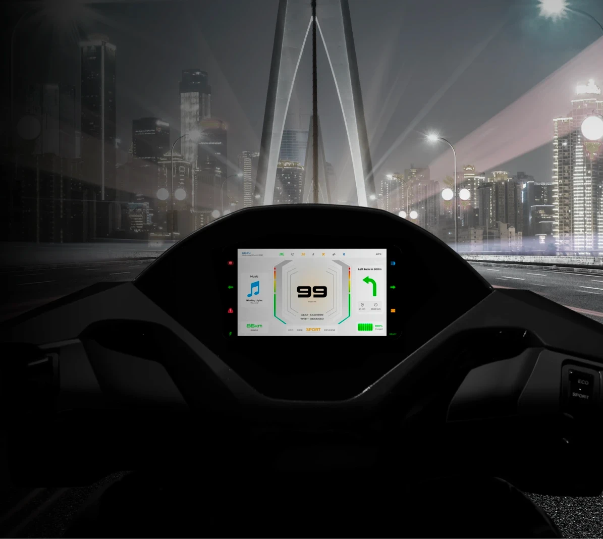
EV Speedometer Cluster
Companion App (Connected to the EV Speedometer Cluster)
VMS (Vehicle Management System)
Fleet app
FMS (Fleet Management System)


Visual Identity
Bolt.Earth is a one stop solution for all your EV charging needs, powering the EV ecosystem.
The primary logo includes the full Bolt.Earth name along with the tagline and should be used in its full form at all times. The primary color choice for our logo is ‘Bolt.Earth Green’. The white logo variant is our lowest priority and should only be used in limited instances or where backgrounds are complicated and printing capabilities are limited.


The primary colors are Bolt.Earth Green (#26C72D) . At least one of these core colors should appear in any Bolt.Earth communication. In most cases, Black (#202020) is used for title text and Light Gray (#808080) for body. Neutral colors are also used for backgrounds. The primary supporting colors should only be used in a supporting role to color sub-brands, new levels of data, chart graphics, illustrations, iconography and detailed information.

Montserrat is the primary typeface used in headlines, subheadings and body copy with different prefered weight
Below are guidelines/specifications for text within Bolt.Earth digital brand collaterals.Please note text sizes for larger media like standees, backdrops etc would vary as per proportions at site. The below are guidelines are for (largely) digital media


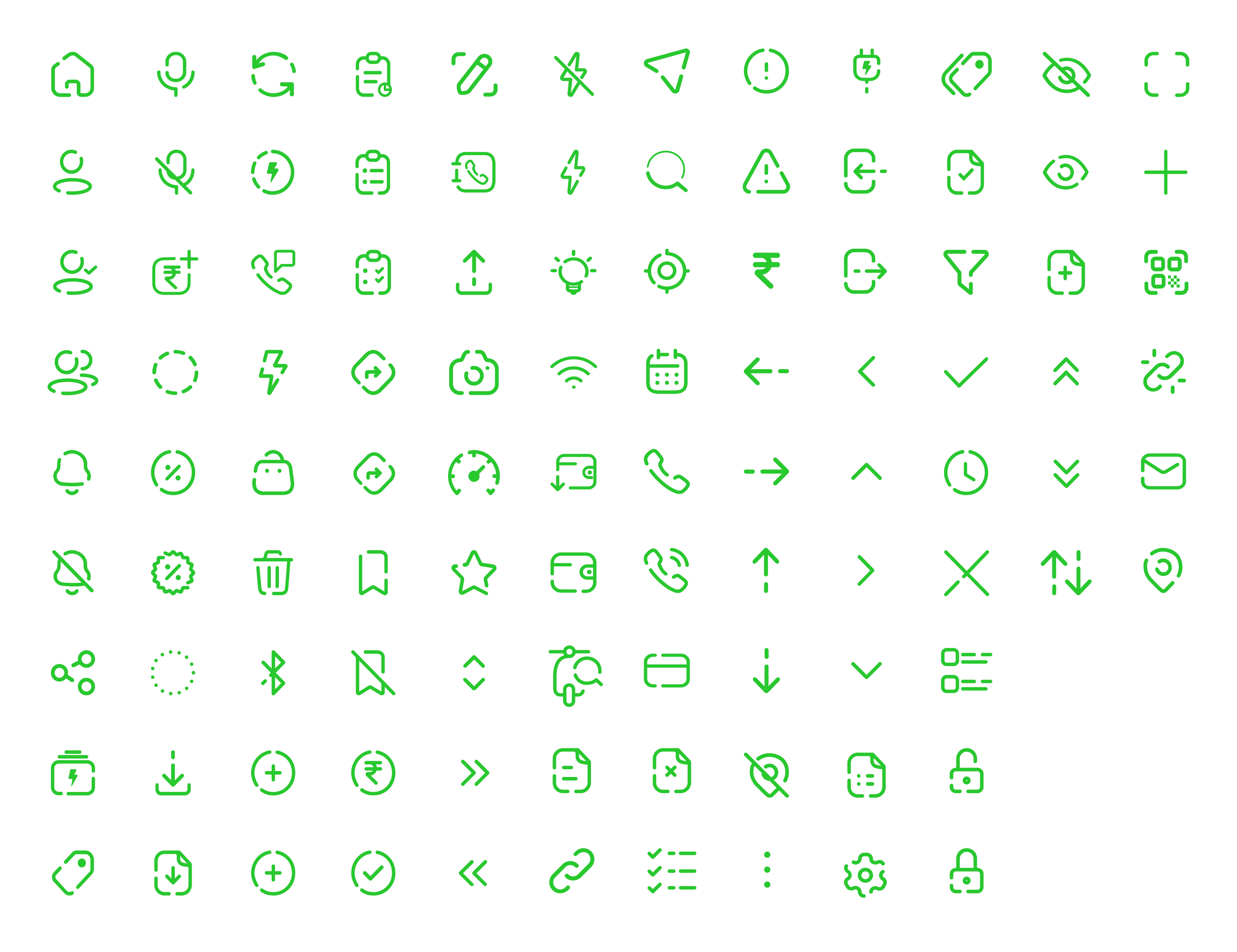
Iconography
Each icon in Bolt.Earth’s icon set is not just consistent in terms of style and colour, it also incorporates distinctive characteristics. The stroke has two breaks with gap of 2px, a roundness of 3px and thickness of 1.5px with butt cap which helps strengthen it's brand character by representing elements of connectivity and gives the icons a distinctive/unique Bolt.Earth characteristic


Let's Talk
Poorna Portfolio 2023
India